

Setting up Variables
Variables are page (dashboard) wide parameters that allow you to pass information between components and create dynamic dashboards that update based on user input and selections.
6.1 Setting up variables
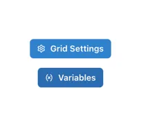
Section titled “6.1 Setting up variables”Variables are set up at the page level by clicking on the “(x) Variables” button in the right hand pane, which is visible when the grid is selected (by clicking on any empty area in the grid).
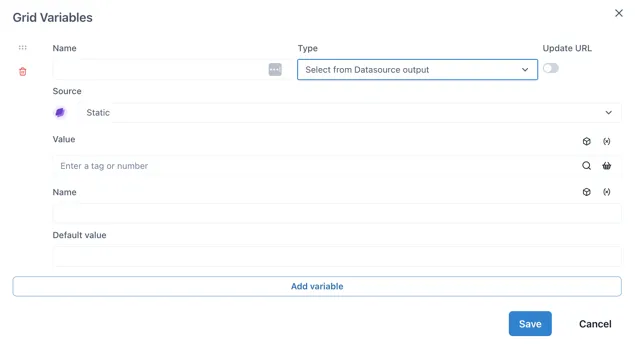
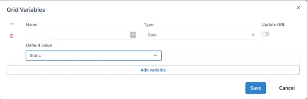
This will bring up the Grid Variables form:
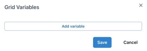
Clicking “Add variable” adds an empty variable configuration. The Name and Type fields are always present and the fields thereafter depend on the selection made in the Type field:
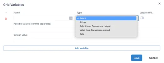
Name: Text input for the name of the variable. Must start with a dollar sign ($) and contain only letters and numbers. No spaces or special characters.
Type: dropdown to select where the value of the variable comes from. It has the following options:
Select: type a comma separated list of possible values directly in the variable configuration.
String: a text string entered into the variable configuration.
Select from Datasource output: The list of possible values comes from an Ingenuity data source.
Value from Datasource output: A boolean indicating if multiple values can be selected for this input.
Date: A boolean indicating if multiple values can be selected for this input.
Update URL: Enable this to update the URL with the selected value of the variable to create a link to the state of the page that can be shared.
6.1.1 Select Type variables
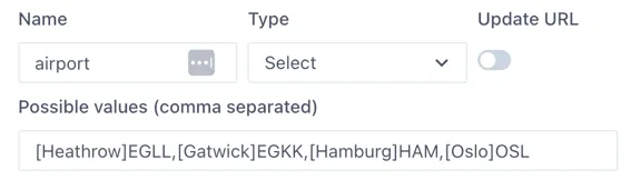
Section titled “6.1.1 Select Type variables”The Select type variable lets a user select from a pre-defined list of options. These are typed as a comma-separated list in the “Possible values” field. For example,
Aa, Bb, Cc
To show a more user friendly name to the user, labels can be defined in square brackets before each variable:
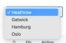
\[Label 1\]Aa,\[Label 2\]BbFor example, a list of possible airports with their codes would be defined as:
The user will see:
Use “Default value” field to define the value that will be selected the first time the page loads (and if there is no value passed in the URL).
6.1.2 String Type
Section titled “6.1.2 String Type”The String type variable takes text input from a “Control” component and stores in in a page variable.
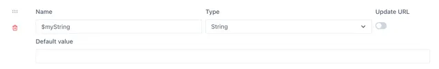
This is useful where the user is required to input text that is passed to an external data source, that cannot be pre-defined.
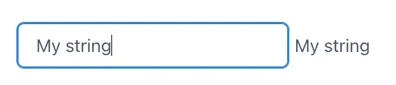
The example below uses a Control component to enter the data into the $myString variable and display it in a Text component
6.1.3 Select from Datasource Output Type
Section titled “6.1.3 Select from Datasource Output Type”This variable type takes the list of possible values from any of the installed data sources in Ingenuity. Much like the configuration of a component on a dashboard, the data source is selected from a dropdown list and the fields underneath will update to reflect the inputs and outputs from that data source.
Where the data source requires an input, this can come from other page variables (by clicking the (X) icon) or the Knowledge Graph (cube icon).
Variable name must be prefixed with ”$”
Section titled “Variable name must be prefixed with ”$””The “Select from Datasource Output” type variable is an advanced variable that can contain a data object rather than a single value or string. Because of this, the variable name must be prefixed with a dollar sign ($). For example, “$foo”. If the variable name does not start with ”$”, the Control component connected to it will show
6.1.4 Value from Datasource output Type
Section titled “6.1.4 Value from Datasource output Type”The “Value from Datasource” type returns a single value for use in a component such as a Number, Level, Dial, Gauge etc. It is not used with a Control component.
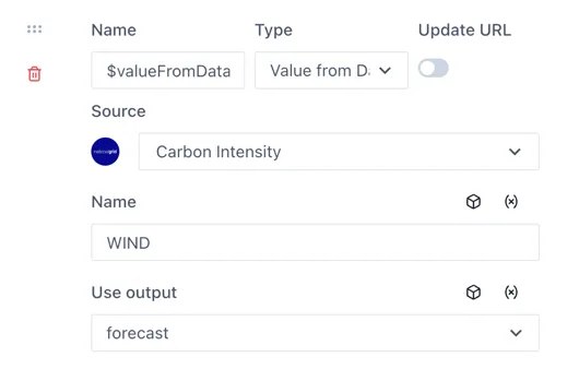
The use case for this variable is to pass values to other variables.
6.1.5 Date Type
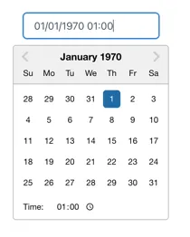
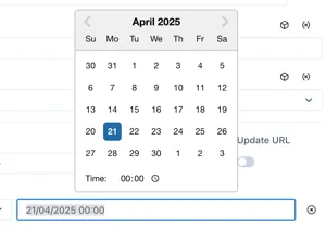
Section titled “6.1.5 Date Type”Date type variables store a timestamp.
When connected to a Control component, users can select the data and time from a date picker:
Default value
Section titled “Default value”The default value has two options: “Static” and “Now”
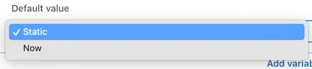
If “Static” is selected and the value field left blank, the date picker will start at 1^st^ Jan 1970, which is most probably annoying for users. Clicking in the field to the right of the dropdown will show a date picker and it is a good idea to set a date (and time).
Selecting “Now” will show additional configuration options:

Offset: -1d for yesterday,
Default minute: [0 — 60] Set to 0 for the start of the nearest hour
Default hour: [0 — 24] Set to zero for midnight, 8 for 08:00 etc.
Default day: [1^st^- 31^st^, Last] Select the day of the month
For example, to default to midnight on the 1^st^ of the month:
